

At Home With House & Garden
After finding this sleek Mid-Century home listed online, Fleur Sibbel discovered an added attraction: it had been built by her own father more than 40 years before.
STORY Carli Philips | STYLING Heather Nette King | PHOTOGRAPHY Mike Baker
Fleur Sibbel, co-owner and managing director of furniture company Zuster, first saw this house late one night when she was scrolling through real estate listings online. Curious, she made an appointment for a viewing which confirmed her suspicions: the 1970s house was originally built by her father, Meyer, part of a family of builders who migrated to Australia from Holland
after World War II. Sibbel Builders was renowned for its high level of workmanship and forward-thinking ideas, such as siting homes with a northerly aspect, installing concrete slabs with hydronic heating and limiting excavation in order to preserve sites as much as possible. Indeed, Heritage Victoria acknowledged the company as being ahead of its time in terms of environmentally friendly building.
“When I first saw the house online I suspected it may have been one of Dad’s projects – all Sibbel houses had signature features with consistent elements: rectangular door handles, crown-cut timber, flat roofs, timber-clad walls and handcrafted built-in furniture,” says Fleur. “The original owners of this particular house sold it to a family that had plans to demolish it and build a McMansion, but things didn’t pan out for them – luckily for us! It was just so timeless and had glass looking out all across the north.” Fleur and her family – partner Simon Ansell, children Chloe, 23, Willem, 18, Gracie, 11, and Harvey the cockapoo – moved into the home in 2016 and renovations got underway the following year. “We lived in the house throughout and just room-hopped as we went. It was really important to be on site every day,” says Fleur. All through the process, she worked closely with her sister Wilhelmina, co-founder and creative director of Zuster, and her father.


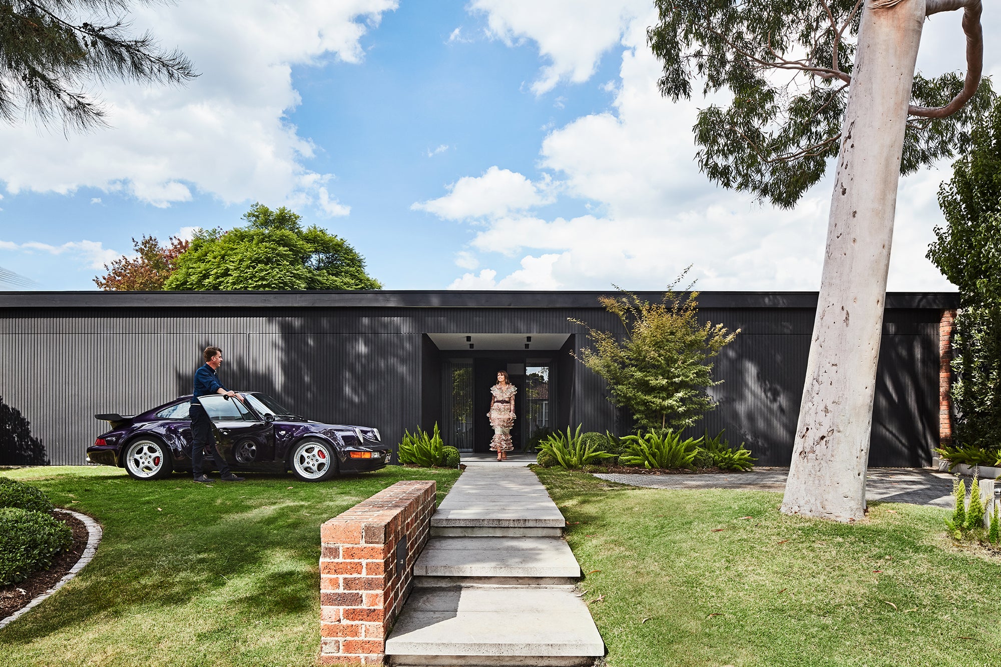
Originally, access to the house involved walking through the carport. Now, a new entry consists of a vestibule followed by double sliding doors that open into a generous arrivals area. Sliding doors are a feature throughout the house so certain areas can be closed off to contain heat or cooling. When they are all open at the same time, there is a line of sight from the front all the way through to the rear. The main bedroom, to the right of the entry, was kept in position but extended outwards. In the living room opposite, the 1970s cabinetry was still in good condition so was retained intact. The kitchen was a time capsule and while the decor got a work-up, Fleur was adamant about retaining the existing timber ceiling. “So many people don’t know what to do with Mid-Century homes and end up just painting the ceiling and beams white. We wanted to celebrate the home’s beautiful timber panelling and signature Sibbel design features, so kept as much as we could salvage, then painted the beams grey and the exterior black.”


A separate playroom was converted into the dining room and one of its walls knocked out to better connect it to the kitchen. Instead of hinged doors, Fleur used another set of sliding doors, adorned with feature handles. From here on, however, the house felt like it came to an abrupt stop.
“The original owners had built a granny flat that was attached to the house and closed off about here,” says Fleur. “It even had its own separate side entrance with a bedroom, bathroom and kitchen. So we created a double door and made this whole area into a bar and hangout space. It flows really well now. It also meant we could have separate living and TV rooms.”
Outside, the home’s facade was reclad and painted Dulux Black. A triple-car garage – a special request from Simon – was added to the left of the house. To the right, an existing carport was retained, although reduced in size thanks to the main bedroom’s newly expanded walk-in wardrobe, which protrudes into the space. “You can clearly see our priorities!” says Fleur, laughing. This extension added another 92 square metres to the home’s existing 400-square-metre footprint.
Inside the house, the theme is dark with moody colours and furniture like Zuster’s embellished oak dining table, matt black tapware and graphite grasscloth wallpaper. “It just feels so cosy,” says Fleur. “I wanted something comforting because there’s a lot of brightness in the natural timber which was hard to modernise. I felt like black worked really well with the original features.
“When we first told Dad about the house he said we should knock it down and build something more modern. We weren’t sure if he was joking! But he got involved in the process and I know he was pretty chuffed.”


